The Dos and Don’ts of Icon Design

The Dos and Don’ts of Icon Design
Introduction
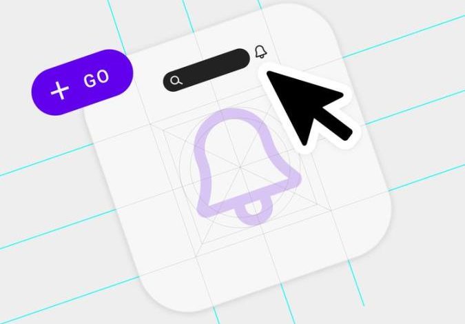
When it comes to designing icons for your website or mobile app, it’s important to ensure they are visually appealing, intuitive, and consistent. Icons play a crucial role in user experience, aiding in navigation and conveying information effectively. In this blog post, we will explore the dos and don’ts of icon design to help you create icons that stand out and enhance user engagement.
The Dos of Icon Design
1. Keep it Simple
One of the key principles of icon design is simplicity. A good icon should be easily recognizable at a glance and convey its meaning without any confusion. Avoid complex or cluttered designs that can confuse users. Instead, opt for clean lines and minimalistic shapes.
2. Use Consistent Style
Consistency is crucial in creating a visually cohesive user interface. Stick to a consistent style throughout your icons to maintain a harmonious look and feel. Whether it’s flat, glossy, or skeuomorphic, ensure all your icons follow the same design language.
3. Optimize for Scalability
Icons are used across various devices and screen sizes. Therefore, it’s important to design them in a way that they can scale without losing clarity or becoming pixelated. Test your icons on different devices to ensure they maintain their visual integrity.
4. Consider Context
Icons should be intuitive and easy to understand in the context of their usage. Take into consideration the purpose and function of the icon within your interface. A well-designed icon should convey its meaning without the need for additional text explanations.
The Don’ts of Icon Design
1. Avoid Overcomplicated Designs
While it’s important to be creative, avoid designing icons that are overly complex or intricate. Complicated icons can be confusing and hinder user comprehension. Remember, simplicity and clarity should always be the primary focus.
2. Steer Clear of Common Misinterpretations
Icons should be universally understood, so be wary of using symbols or metaphors that may be misinterpreted across different cultures or demographics. Conduct user testing and gather feedback to ensure your icons are universally recognizable.
3. Don’t Rely Solely on Color
While color can enhance the visual appeal of icons, it should not be the sole indicator of their meaning. Consider color-blind users and ensure your icons are distinguishable even in grayscale or with limited color visibility.
Frequently Asked Questions
Q: How do I ensure my icons are accessible for people with disabilities?
Icons should be designed with accessibility in mind. Use alt text to provide text alternatives for screen readers, and ensure your icons have a large enough clickable area for users with motor impairments.
Q: What file format should I use for my icons?
For web usage, SVG (Scalable Vector Graphics) is recommended as it allows for infinitely scalable icons without losing quality. For mobile apps, you can utilize vector formats like SVG or icon fonts like Font Awesome.
Q: Can I use stock icons for my design?
While stock icons can be convenient, it’s best to create custom icons that align with your brand and design language. Custom icons provide a unique identity and help distinguish your interface from others.
Conclusion
Designing effective icons involves adhering to certain principles while maintaining creativity. By following the dos and avoiding the don’ts mentioned above, you can create icons that are visually appealing, intuitive, and provide an optimal user experience. Keep experimenting, gathering feedback, and refining your icon designs to continuously improve your users’ interactions with your interface.


